Nov 28, 2012

Baby Mini Album

Hello once again fellow scrappers & happy belated Thanksgiving to you all.  Although it seems that everybody is pretty much already in Christmas mode!

Today's post is a mini album that I made for Clear Scraps.  I've used their new Acrylic Recipe Stand 4"x6" Kit & their Acrylic Mini Word Album Baby.  What better way to use both these items than for a mini album showcasing my newborn baby boy.

I've embellished this album in numerous ways!  Here are just a few: ribbon, alcohol inks, stamps, Stickles, Liquid Pearls, paper, lace, transparent elements, flowers & more...

As always, the cover lends itself to be decorated the most.  For the album title of 'Baby' I've embellished the acrylic with alcohol inks.  In my opinion alcohol inks really do add the best & most unique texture to acrylic.  To keep with the color theme of my album which is white, blue & yellow--I used Sunshine Yellow, Sailboat Blue & just a bit of Silver alcohol inks.
In this close up you can really see the texture the alcohol inks gave the acrylic cover.  In person, you can certainly appreciate it much more.

To make my cover stand out more, I highlighted the edges with a white Sharpie paint pen & dots of White Opal Liquid Pearls.
One of my fave embellishments lately has been mini glass vials.  I've added one here filled with blue & yellow seed beads.  I tied some twine around the neck of the bottle.

The flowers on the cover are a combination of mulberry & beaded flowers.  I spelled out my little boy's name with some square alphabet beads that I found at my local A.C. Moore craft store.

I added dimension to my album by adding transparent elements that fall off the page.  Don't be afraid to add embellishments that go beyond your page--this is what gives your project extra dimension.  My transparent elements are a combination of Hambly Screen Prints & Fancy Pants Designs.
I've used ribbon all over this mini album.  I've tied a couple of wide, sheer organza ribbons to the rings holding my album together & I've also cut snippets of ribbon, folded them in half & adhered them to my cover as shown here.

I've punched a couple of holes into the base of my album and run ribbon through them...those are the ribbons you see peeking out from the sides in this close up.
I guess you can say the first photo I had of my son was his ultrasound--so I began my album with this photo.  I've embellished the inside of my album mostly with flat embellishments.  If I add embellishments with too much dimension--my album will become too bulky.  So I've used mostly transparent elements, stamps, Stickles/Liquid Pearls & flat flowers to embellish my pages.
Oh yes, almost forgot.  I've also used a couple of paper piecings.  I've had these puppy, blue bird & yellow duckling paper piecings in my stash for many moons now.  I always knew that one day I'd have the perfect project for them--this mini album was it! On most of the acrylic pages of my album I've added some kind of paper piecing and rub ons to embellish it.

As you can see in this close up--my photo behind the acrylic page peeks through.  That's the beauty of acrylic!  My little guy was just 1 day old here.  :-)

You can get some really unique & creative projects done by strategically placing items on or behind acrylic.
Here's another acrylic page decorated with a blue bird paper piecing and white flourish rub ons.  Again you can see my photo peeking out from behind as well as the script stamping I did.  The script stamping looks like it's part of the acrylic page--but it's not.  I've added the stamping to the page holding my photo.

Behind each page containing my photos I plan to do some lengthy journaling/story telling.  Just conveying my thoughts & feelings on the new chapter in my life.
Here I'm showing several more pages from my mini album.  As you can see, rub ons is what I've primarily used to decorate my acrylic pages.

As a side note--I love the little yellow duckling paper piecing!  :-)

My album still has several blank pages.  I'm in the process of taking & developing pictures of my son--however, the album is pretty much prepped!  All I have to do is add my photos as I develop them and add a bit of flat flowers, stamping, rub ons and/or transparent elements to add a bit of visual interest to my photos & I'm done.

Also, I'd like to note that on all of my pages I've randomly added dots of either Stickles or Liquid Pearls along the edges.  This helps further define the borders of my pages.

To the bottom of my album I've adhered some light blue lace & a bit of white pom-pom ribbon.

Thanks to all of you who stop by for a visit!  I hope this project inspires some of you to get creative with acrylic mini albums.  Enjoy the rest of the week!

Nov 16, 2012

My Toby Layout

Hello again fellow scrappers.  It's time for another reveal over at Once Upon A Sketch (OUAS).

Here's my little fur-baby Toby taking center stage again.  It helps a lot that he's all white--it's easy to match him with any color!  :-)  The page is based on how much our lives has changed since Toby came into our lives.  Pets really are like another member of our families that provide us with unconditional love & loyalty.  My journaling which is stored in the scroll reads as follows:

My Toby--our Toby really...ever since you became a member of our family you've filled a void we didn't even know we had.  You bring sunshine & laughs to our otherwise mundane lives.  Your 'childlike' ways never cease to surprise or amaze us--and we'll never figure out how such a small dog can have such an enormously loud bark!  You're our Toby--but I see you as 'my' Toby.  I was the first one to hold you as a puppy & look into those big brown trusting eyes.  When I look at you today, I see a grown dog with eyes that are still trusting, but are now also filled with unconditional love, devotion & loyalty.  You belong to our family, but to me you'll always be my wet-nosed confidant, my undercover furry friend...my sweet little Toby.

Here's the sketch provided by Nadia that my page is based on.
I've used doilies, flowers, mushroom birds, nests & lots of ribbons on this page.  In fact, most of my background is made up of ribbon.  All ribbons & twine seen on this page were sponsored by Scrapbook Fantasies.
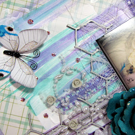
The gorgeous light blue flower is by Manor House Creations--I'm loving their flowers more and more lately!  I've tucked a bit of aqua & purple tulle underneath my large flower to soften the page a bit.
The butterflies are new designs that will soon be available in my Etsy shop.  So keep an eye out for them!
The honeycomb chippie is by Dusty Attic.  My title was printed on a transparency, cut out & adhered with clear dry glue.

I really liked this one particular metal word band by Tim Holtz that reads: "live the life you've imagined".  That would be my Toby.  Oh he really does live a 'dog's life'.  Eats all he wants, sleeps all he wants--total pampered pooch...even in the photo he's holding a bone that he happily chewed on for hours and hours!

The pearl flourishes are by Prima.  The small glass vial is from my stash--I've filled it with small beads, also from my stash.
Something that has become a trademark with my pages lately is how I store my journaling.  It's stored in the form of a scroll as shown here.  If interested on how I go about making this scroll journaling--you can find a tutorial for it here.
The background is composed of gesso with random smears of Frozen Lake & Blitzen glimmer mists.  The gesso was applied with a small spatula while the glimmer mists were applied with a paint brush.  I didn't spray the mists directly onto the paper this time.  Instead I sprayed them directly onto my Ranger Non-Stick Craft Sheet & then dipped my paint brush into the ink & painted away.

I've also tucked a bit of cheese cloth behind my trio of pictures.

Thanks for stopping by!  Make sure you visit the OUAS blog to see how the other talented DT's interpreted this challenge & sketch.

Enjoy the rest of the week!

Nov 14, 2012

My Little Devil Layout Clear Scraps & Quick Quotes

Hello once again fellow scrappers & bloggers!  Today I bring you a page full of both Clear Scraps & Quick Quotes goodies.  I know I'm a little late with the Halloween page--but I couldn't resist using these papers & embellishments by Quick Quotes that screamed 'Halloween'.

This would be my pup Toby dressed up as a little devil for Halloween last year.  I've been saving these pictures to scrap them with just the right supplies--well this was it!

The base of my page is a square Clear Scraps XL Scallops shape. I've done several techniques in order to give my clear acrylic background some texture.

All the papers seen on this page are by Quick Quotes.  They are as follows:  Halloween 100, Halloween 200, Halloween 300 & Halloween 400.   The 'My Scary Little Monster' cut out is also by Quick Quotes.  I hand cut that phrase from the Halloween 500 phrases.

I've used an actual mini frame that I found at my local Michaels for about $1.50 to frame one of my photos.  I've tucked a bit of cheese cloth behind my frame.

The fabric flowers are by Webster's Pages & the black vine is by Prima called Holiday Lights Glitter Spray Black Ivy.
All of the chipboard used on this page is by Dusty Attic.  To give the chipboard that shimmery look I first painted it with black acrylic paint--except for the moon which I painted a deep orange.  Next, I highlighted the bat wings & one side of the haunted house with a white gel pen.  Finally, I inked all of the chippies in embossing ink & heat embossed them with Star Dusty transparent embossing powder by Stampendous.
I punched a thin trim with my Martha Stewart Cherish punch.  I then did a bit of hand stitching to further define my punched trim.  I also dressed up the entire border of my page with dots of Liquid Pearls White Opal & Enamel Accents in Black.

I've distressed the edges to a few of my papers and inked them with Mango Mai Tai Chalk Ink by Quick Quotes.
Half of my page is actually see through--since the base is acrylic.  I've inserted a white card stock behind my page so that the texture I gave my background can be seen better.

These random splatters were made with alcohol inks & a can of compressed gas duster!  To see a quick tutorial on this--feel free to check it out here.

I used the following alcohol inks on this page: Purple Twilight, Sunset Orange & Citrus.
This vellum quote is by Quick Quotes called Be Afraid...
I also did a bit of stamping on my acrylic base.  Those bold black swirls seen in this photo is actually a stamp.  I've used Jet Black Staz On to stamp onto my acrylic.  Always remember to use a permanent solvent ink like Staz On when stamping on acrylic.  Using another kind of ink will cause your image to smear.
Make sure you stop by the Clear Scraps blog & participate in the blog hop in accordance with Quick Quotes

Here are today's blogs!

Today's prize from Clear Scraps is....
 
 
CSAEleaves-2
CSAEbirds-2
All you have to do is "LIKE" the Clear Scraps Facebook Page and
comment on the blogs!
Thanks to all of you for stopping by!  I hope this page inspired some of you to experiment with acrylic.  Have a great rest of the week.

Alcohol Ink Splatter Tutorial

Hello fellow scrappers!  Just a quick tutorial to showcase how you can get random splatters of alcohol inks onto acrylic backgrounds.

This technique can be seen on 'My Little Devil' page.

It's a very simple technique actually.  All you need are alcohol inks and a can of compressed gas duster.

Step 1: Work on the back of your acrylic--remember, acrylic is clear so working on what will be the back of your acrylic will display on the front of your page with no issues.  I work this way because the surface where you actually use the alcohol inks can remain a bit sticky--so might as well use the non-sticky side as the main base for your page.  Just randomly apply drops from your bottle of alcohol inks directly onto the acrylic.  Then before the ink dries blow puffs of compressed gas onto your alcohol ink drops.  This will create random splatters of ink.

Step 2: Work with one color at a time--this is more of a tip than a step.  Don't try to work with all of your inks at once--you run the risk of having a bit of the ink dry up or it can just get too messy.  Also do remember that if you do mess up--alcohol inks combined with acrylic are very forgiving.  Just take a paper towel...pour a few drops of alcohol ink blending solution and simply rub off the alcohol ink from your acrylic.  Then simply try again!
Here's a photo of my own can of 'Dust Remover' or compressed gas duster.  I use it to clean my computer keyboard--but can also be used for crafting as shown here.  You can find these cans in any office supply store such as Staples or Office Max.  I've also seen them in Target, Walmart & Kmart.

Enjoy!

Nov 7, 2012

You Should Know... Layout

Good evening fellow scrappers!  Well, first it was hurricane Sandy--now we're going through a snow-storm.  Hmmm...Mother Nature doesn't seem happy with the East Coast lately.  :-(

Being snowed in though did give me time to play along with the latest challenge going on over at Color...Stories...Inspiration (C.S.I).  I actually finished this page in one sitting.  It was just a burst of inspiration--don't you just love it when you get those!

I'm also entering this in the current 'Go Crazy' challenge for Berry71bleu.  I used bold colors on this page, combined several different elements onto one page & actually did a first which was to spray the entire page with a shimmering mist--more details on this coming up.

This page is actually about me.  Once in a while I'll do a page on just lil' ol' me.  Simply because us scrappers hardly ever do that.  If you think about it though--if there's one bit of legacy you wish to pass down to your future generations; what better legacy than yourself?  So that's exactly what I'm doing here.  Now that I'm actually going to start a new chapter in my life--that of a mom--I keep thinking to myself what would I want my child to know about me?  As parents we spend the majority of our lives trying to understand, guide & just plain figure our kids out.  But our kids don't really figure us out or truly understand us until they become young adults themselves.  At least that's how it was for me.  I didn't really understand my mom & all her hard work until I was in my early 20's.

So the journaling on this page consists of four things that I'd like my future child to know about me.  It's a bit on the private side--meant for his eyes only--but like the title of my page states--it's four things about me that I feel he 'should know'.
Here's the case file my page is based on.

For my evidence I have the following: stripes, flowers, swirls, transparent element, doily pattern & something that rolls up

For my testimony: I journaled 4 things about my subject--which is me
I actually cut one large doily in half & positioned both halves to make it look like one extra large doily in the background.

My title was printed on a transparency & adhered with clear dry glue.

As previously mentioned, I actually did a first on this page too--I spritzed it entirely (except for the photos) with Shimmeringz Bronzed Bombshell.  It actually added this nice soft brown/goldish shimmer to my entire page that I really loved.  You can kind of see that shimmer in this photo.
I combined several elements on this page when it comes to embellishments.  I had this large felt flower in my stash that I had been itching to use & I finally found the chance to do so on this page.  I bought several of these lovely felt flowers from an Etsy shop called KnockKnocking.

The grey & orange flowers are by Prima as are the flourishes, the light bulb & the wooden 'dreams' trinket.

Including something that rolls up on my page was easy enough!  I've been doing that a lot lately on my pages in the form of my journaling which I tend to store as a scroll.  Here's my journaling once again tucked away in a scroll.  You can find a tutorial on how I go about making this scroll journaling on my blog here.

The cute little resin bird is also by Prima.
I tucked a bit of cheese cloth behind my photos.  The transparent black, swirl frame was by Hambly Screen Prints.

Another little embellishment that has become customary on my pages lately are my little glass vials full of beads.  I've adhered one here yet again right next to one of my photos.
I've tucked two organza ribbons underneath my large felt flower.

The grey resin cameo tucked underneath my ribbons is by Webster's Pages.
A closeup of the other half of my doily peeking out from the rolled paper.

Thanks to all of you who stop by for a visit!  Enjoy the rest of the your week...

Nov 1, 2012

Then & Now Layout

Hello once again fellow scrappers!  Phew...here in NJ we are starting to slowly recover from hurricane Sandy.  It hit NJ hard especially towards the south of Jersey and our Jersey shores.  Looks like our shores will never be the same again.  :-(  However, my family & I are thankful that we made it through without any major issues.  My small house hung in there--even though at times the gusts of wind were so strong that my entire house would shake & the lights would flicker.  We were also one of the very few lucky ones that didn't lose power (knock on wood)--and when I say 'few' lucky ones--I mean exactly that.

I found some time to scrap this quick page of my husband for the latest challenge going on over at Color...Stories...Inspiration (C.S.I) case file #43.  Who says you can't use flowers for a male page?  I found myself bold enough to do just that with this page & I think it turned out ok.  Even when I showed it to my husband--he didn't think it was too 'girly' at all.  I think it's all about the colors you use and the material of the flowers.  Using anything sheer may have given this page a bit of a feminine appeal which I didn't want.  So I stayed away from organza or sheer flowers.

Both of these photos is my husband.  The one in the background is him at approximately 12 years of age.  The main photo is him today.  My page is about letting my husband know to always keep the 'kid' in him living within his heart.
Here's case file #43 that my page is based on.

I used the following for my evidence: damask, ribbons, frames, something transparent & rub-ons

For my testimony I tied the past to the present.
I found this plate to hold my title.  I adhered some alpha stickers by Glitz Design to a bit of vellum for the title.

My journaling is stored in the scroll.  Something that has become a trademark lately of my pages.  All the pages I've been scrapping lately have a story to tell--& I find that storing my journaling in the form of a scroll is the most convenient way to store it & I love the cute little embellishment it provides my pages.  You can find a tutorial on how I make these scrolls here.

My journaling reads as follows:

I absolutely love this childhood photo of you.  At that point of your life --you were no longer a boy--but you were not quite yet a man.  You were approximately 12 years old here & it amazes me sometimes how I still see that young 'teen' within you at your current age of 42.  Yes, time has taken its toll & physically you are no longer 12--but I still see that kid in your eyes.  That's where he lives.  He also makes guest appearances once in a while within your playful personality.  You stress with the demands that adulthood brings--but once in a while you take the time to touch base with that 12 year old pre-teen.  He's a part of your past--but he still lives within you--don't ever forget to take that kid within your heart always.

I recently bought myself a splatter stamp by Vilda Stamps.  I instantly put it to good use!  Love the paint splatter effect it gave me.  I used Jasmine Mix'd Media Inx by Donna Salazar to stamp my image--then with a white gel pen I colored in some of the splatters to make them pop off the page a bit more.
The background is composed of some hand stitching & ribbons as shown here.
A close up of my cluster of flowers.  The flowers here are composed of Manor House Creations, Wild Orchid Crafts, I Am Roses & resin flowers from my stash.
This gorgeous large flower is by Manor House Creations.  You can see one of my rub-on frames tucked underneath the large flower here.  I applied the rub-on frames to vellum and then cut them out.
The flourish chippies are by Dusty Attic.  I kept the texture of these flourishes simple.  I first painted them with gesso, then inked them with embossing ink & finally heat embossed them with Star Dust transparent embossing powder by Stampendous.  In person, these flourishes give off a fabulous shimmer.

Thanks for stopping by for a visit!  Enjoy the rest of your week.