Dec 30, 2011

My Joy Layout


Good morning fellow scrappers! Hope all of you had a fabulous Holiday. Now onto the final countdown of 2011. Um, where DID this year go? Can someone let me know!?

Along with the end of 2011 comes my end with Sketchabilities. This will be my final post with them. I had a great time while on this DT. The sketches were a great challenge for me & pushed those creative juices.

I did a Christmas page for this sketch. Tis the season right? I took this very cute candid shot of my hubby & fur baby Toby while doing our annual Christmas card photo shoot. This photo worked just right for this sketch & my overall Christmas theme.

I used one of the December scrapbook kits by a very cute Etsy shop by the name of Funtoolas. This particular kit contained the lovely papers 'Waiting for Santa II' by Pion Design.

Here's the sketch my page is based on. Karan comes up with some very versatile sketches--they can be interpreted in many ways & they kick your creative skills into high gear. :-)

I used a brick mask by Prima for the background. For my inking, I used Aged Mahogany & Chipped Sapphire distress inks.

The snowflakes are actually Christmas tree ornaments that I found at my local Target for $1.00. They come in packs of three, are light, flat & fit perfectly on scrapbook pages. You can also use snowflake dies--I just don't have any--so I ended up using these ornaments instead.

The Santa tag is a cut out from one of the Pion papers. I distressed & inked the edges.

This very elegant metal embellishment came with the Funtoolas kit.

I used a scrap of glassine paper by Tim Holtz to mat my photo. I just wrinkled the glassine several times & then swiped some Walnut Stain distress ink over the wrinkled glassine. I'm loving this glassine paper! My next newfound love is cheese cloth which I've used to mat my photo as well.

The title 'My Joy' is a combination of a transparent label made with my Dymo label maker & some American Craft Thickers that came with the kit. I wanted my titled to be in a certain position on my page. It didn't quite fit on my photo & there was too much of a gap between the photo & my background where even if I adhered my title with pop dots--half my letters would be distorted. The solution? Transparencies! TIP: Adhere your title onto acrylic or transparency. Then simply cut it out. This way you can place your title anywhere--like one large sticker without distorting it. This works great for pages with lots of dimension--and as you can see from my photo--it's really not noticeable at all. The title almost looks like it's floating on it's own. Magic I say!

I did a few random tears into my page. I then punched out small scraps with my Martha Stewart Wildflowers punch around the page deep edge punch. These scraps I tucked behind my tears. I then added one safety pin to each of my tears.

Finally a close up of some of my stamping. I can't have a page without at least one stamp in it! The splatters is a stamp by Recollections and I believe it's called just that 'Splatters'. I bought it at my local Michaels. The script stamp is by Donna Salazar & is called 'All My Love'.

Thanks to all of you who stop by for a visit. I'm always grateful to you. Feel free to hop on over to the Sketchabilities blog to see the other DT's take on this sketch & to play along if you can!

May you all have a wonderful, happy & safe New Year!

I'll be back in 2012...

Dec 25, 2011

Christmas Wishes


From my family to yours, have a very Merry Christmas! It truly is a 'wonderful life'!

Dec 19, 2011

Magic Layout


Good evening fellow scrappers! So Christmas is just days away...another year almost over. Can the time go by any faster!? Sigh...one of the best things though about this time of year are the pictures we get to take. Here's one of my latest Christmas faves. It's a completely candid shot of my husband, Toby & myself. This was taken on our annual amateur photo shoot for our Christmas cards. None of us were ready, we weren't looking at the camera--we were simply being ourselves. I loved it! So very much that I ended up using this as part of our Christmas cards. :-) Of course I also had to scrap it.

I used the lovely papers Waiting For Santa II by Pion Design for this page. I was able to finally get my hands on them via a wonderful Etsy shop I discovered by the name of Funtoolas. Even the name is catchy! Cindy the owner of Funtoolas puts together lovely kits. She had two December kits this month--I was lucky enough to snag the Pion kit. I had heard much about this Swedish company & the papers were perfect for my photo.


I'm submitting this page for the Once Upon A Sketch (OUAS) December 15th challenge. Here's the sketch my layout is based on. I flipped the sketch on it's side for my page. The theme for this challenge was how you spend Christmas Day. For me Christmas Day is spent quietly. It's quality time with family. We celebrate on Christmas Eve which is tradition for Latin American countries. So on Christmas Eve my family has Christmas dinner & on midnight we open up our gifts around the Christmas tree. We go to bed late--and then spend Christmas Day talking, laughing & sharing memories.

A close up of the flourish chippie & my snowy trees. The chippie is part of the Holly Flourish by Dusty Attic. All of the trees is actually a large stamp by Magnolia called Winter Forest. I stamped the image on dark green patterned paper. Cut them out and randomly colored them with a VersaMarker pen. I then heat embossed them with Peeled Paint distress embossing powder. Next I cut each layer of the tree out--added my 'snow' on the layers & then put the trees back together again with foam dots. This gave my trees a 3D effect. I hope to do these trees again in my next Christmas page--I really liked them a lot! I'll capture a couple of screen shots as I make them. This technique can work for any kind of tree stamp or image that has layers that can be cut out.

The silk flowers came with the kit. Aren't they pretty?

The doe is a die cut by Tim Holtz called Reindeer Flight. He die cut a doe from sticky back canvas for one of his 12 tags of Christmas and this is where the inspiration for my doe came from. The doe is die cut from sticky back canvas, then randomly inked with Frayed Burlap distress ink. I then adhered a bit of mini garland I had in my stash & tied a bell on her neck with a bit of twine.

For the corner I adhered four different kinds of coordinating scraps and then curled them upwards. This gives the illusion of having several pages clustered together. I tucked some hollies & flowers in this corner.

I used a bit of cheese cloth & a crumbled piece of glassine paper by Tim Holtz to mat my picture. The glassine was wrinkled several times & then inked with Walnut Stain distress ink. The metal flower embellishment came with the Funtoolas kit.


The large multi-colored snowflake in the corner was done with a Tattered Angels stencil. I spritzed the stencil with a variety of different mists & smooch. Then I 'kissed' the paper to my misted stencil. This created a washed out multi-colored imprint of the snowflake on my paper. I then heat set it before it smeared.
The random script seen throughout my page is a stamp by Donna Salazar titled 'All My Love'.


A close up of my other smaller tree. Did I mention how much I loved these little trees? :-)

Thanks to all of you who stop by for a visit.

Dec 15, 2011

Love Cake Layout


Good morning fellow scrappers & bloggers! It's time for another sketch over at Sketchabilities!

This is me & my husband on our wedding day. These photos were taken during the cake cutting. Our DJ referred to the cake as our 'love cake'. As I was scrapping this I remembered that specific comment & therefore his comment became the title for this page.

Here's the fabulous sketch by Karan this page is based on. I enjoyed working with circles instead of the usual squares or rectangles--I love it when sketches take me away from what I'm 'comfy' with. It makes me take my creativity one notch higher.

A close up of one of the flourish chippies. These are made by Dusty Attic. The chippies were painted with a deep burnt orange acrylic paint. Once dry I inked them with embossing ink & heat embossed them with Star Dust transparent embossing powder by Stampendous. In person, they give off a very shimmery effect.

The resin window is by Prima. Here you can also see a bit of the hand stitching I did going around the circle. This particular stitching I saw over on Irene Tan's blog--better known as Scrapperlicious. She refers to it as the long stitch technique. In order to get that zig zag pattern the stitches are all done in a very long angle. Next time I do this stitch I'll do a brief tutorial on it for those who are interested.

Here's me & my hubby cutting the cake & posing for the camera at the same time. :-) The colorful circle behind us is by Pink Paislee (Mistables). I inked it with a few distress inks (Stormy Weather, Mustard Seed & Wild Honey) then spritzed it once with Suede glimmer mist.

A close up of the second smaller photo. Both frames for my photos is also by Pink Paislee.

Thanks to all of you who stop by for a visit--it's always very much appreciated!

Don't forget to stop by the Sketchabilities blog & check out the other talented DT's take on this sketch & do play along if you can!

Dec 9, 2011

Friends Furever Layout


Good evening once again fellow scrappers & bloggers! Today's page is one I did for Stamp Enjoy. It's also a remake of an older page titled "Just the 2 of Us". I felt my original page was a bit too feminine--so I re-did it while keeping only certain elements but adding more of a 'grungy' masculine theme.

This is my husband & my little fur-pup Toby. These two are 'my boys'--the men in my life! This photo captures the bond & special friendship these two share. Yes, it's true that my husband isn't exactly a 'little boy' anymore. But the friendship they share is the typical 'boy & his beloved dog' that we've all heard about since the Little House & the Prairie days. As usual, Toby seems to be smiling in this picture. How he pulls that off is beyond me...but he somehow manages to smile in the majority of his pics!

As previously mentioned, I tried to keep this on the masculine side; therefore you'll notice a bit of 'grunge' in the style of this page. However, I did manage to include flowers in order to soften it just a bit. They are what I call 'man flowers'. :-)

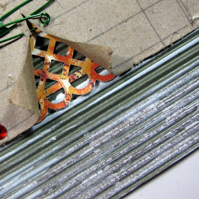
I used a corrugated 'flute' cardboard by Canvas Corp for the background. I did a lot of embossing/painting on the corrugated cardboard. I also did a bit of stitching & went a little tag crazy in the upper left hand corner! :-)

Here's a close up of one of the two beaded flowers with burlap bottoms. The burlap portion of the flower I made by doing my 'burlap flower' tutorial found here. The beaded flower is an item you can find in my Etsy shop. I have several beaded flowers in a variety of colors. So if interested, please do feel free to stop by. These beaded flowers really do add a nice finishing touch to any project. The metal string circle around the beaded flower is an item I found at my local Michaels in the clearance section. I thought they'd be perfect for masculine themed pages.


A close up of the brick wall & my stamped little guy with his pup. The brick wall is a chippie by Dusty Attic. I used the 'brick texture' technique to give it that rustic brick look. I have a brief tutorial for this on my blog. If interested, you can check it out here.

Here you can see my cluster of tags. I made the folded corner act as a makeshift pocket for my tags.

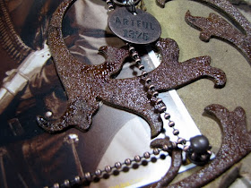
A close up of the flourish. The flourish was die cut with Tim Holtz's Elegant Flourish die on grunge board. I spread a thin layer of molding paste on the grungeboard & then heat embossed with Enamelz by Shimmerz. Enamelz is a thicker embossing powder than your regular embossing powder--so it adds a really nice effect when combined with other media.

Here's my background. It was first completely painted with an olive acrylic paint. Once dry then I randomly spread a bit of molding paste. Finally I sprinkled a bit of silver Enamelz (Silver Fox) & heat embossed it. This gave me a fabulous background. After looking at it for a bit I realized that this would also look really nice for a Christmas themed paged.

I used a piece of burlap from Canvas Corp to put behind my photo. I also again did a combination of zig-zag stitching & straight stitching. I first used this stitch in my 'Essential Cog' page & really liked the look of it.

Thanks to all of you who stop by for a visit! Enjoy the weekend...

Dec 7, 2011

10 Chipboard 10 Ways


Hello once again fellow scrappers! Today's post is one that I'll be storing under the Tips/Techniques categories on my blog. It's a compilation of just a few different ways that chipboard can be altered to give it a certain texture or effect. These 10 pages are a combination of 10 fave pages of mine & 10 different ways I've altered chipboard.

Chipboard has swiftly become a very popular embellishment for pages/projects because it's very versatile & can be altered in so many ways. It can be painted, misted, inked, embossed (both dry & wet)--you can alter it with a variety of different mixed media and I'm sure there are several more ways that I haven't listed or even tried myself yet. I know there are many other talented scrappers out there that have already altered their chippies in very creative ways. These are just a few that I've personally experimented with.

This post also allowed me to backtrack & take a look at how my usage of chipboard has grown since I first started experimenting with it. So before I get anymore nostalgic...let's begin shall we?

First up my page titled 'Outlaw'. I believe this was the very first time I experimented with altering chipboard.

Technique: Chipboard was first inked with Vintage Photo distress ink, then heat embossed with Vintage Photo distress embossing powder & finally I spread a thin layer of Rock Candy Crackle paint. Result is a cracked, very shiny rustic texture. For bigger cracks, apply a heavier coat of the Rock Candy Crackle paint. A perfect addition for masculine pages without being too feminine!

Second page titled 'Opposites Really Do Attract'. I chose thicker components to alter the chipboard heart this time.

Technique: Inked the chippie in Vintage Photo Distress ink. Covered the chippie with adhesive & then sprinkled Martha Stewart brown leaf glitter on it. This glitter is also known as 'chunky glitter'. Once dry I carefully inked the chipboard (more like dabbed it on in order to not remove the leaf glitter) with embossing ink & then spread clear Ultra Thick Embossing Powder (UTEE) on it. Result is a thick yet very shiny texture. This technique is meant for chippies with wide surfaces...not for thin detailed chippies.

Third page titled 'Heart Breaker'. I took out my acrylic paints for this one.

Technique: Painted the heart entirely with red acrylic paint. Dryed it with my heat gun. Then with a brush I dabbed black acrylic paint. Dryed it with my heat gun. Next I dabbed it again with a bit of ivory acrylic paint. Then guess what? Yep, I dried it again with my heat gun. I'm not very patient! :-) Finally I covered the chipboard with crackle medium by Ranger. Result is a very cool splatter paint effect with a crackle texture. The crackle medium from Ranger results in larger cracks than with the Rock Candy Crackle paint.

Fourth page titled 'Love'. Let's hear it for Perfect Pearls & UTEE making it's second appearance.

Technique: Am focusing on the love birds only. I first painted the birds with teal acrylic paint. Once dry (yes, with a heat gun) I spread a bit of perfect pearls on it with a brush. Then I carefully dabbed some Perfect Medium on them (embossing ink can also be used) & spread some UTEE on them. Result is a very shimmery 'epoxy' texture.

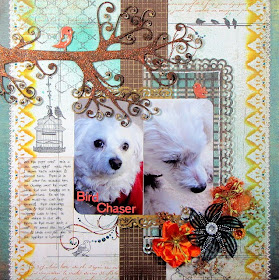
Fifth page titled 'Bird Chaser'. This is a repeat of the above technique--however, the tree branch was altered slightly differently.

Technique: Bird was altered the same way as the birds in the 'Love' layout. As for the tree, it was first inked in Vintage Photo distress ink. Then with my finger I spread a bit of Vintage Photo distress ink followed with some Paprika Stickles. So the texture is a combination of Distress & non Distress Stickles. Finally I decorated the tips of the some of the tree branches with Frosted Lace Stickles.

Sixth page titled 'Priceless'. If you have border chipboard consider taking your crop-a-dile out, punching holes & using them for lacing.

Technique: Punched holes into two border chippies, inserted eyelets into the holes & then used the borders for lacing. By the way, I have a tutorial for the lacing seen on this page here, if anyone is interested.

To give the chipboard that blingy effect, it was first painted with black acrylic paint. Once dry it was inked with embossing powder & then heat embossed with Kaleidoscope Transparent embossing powder by Stampendous. Result is a shimmery, iridescent texture. This technique works especially well when you color your chipboard with dark colors.

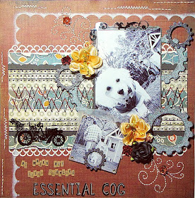
Seventh page titled 'Essential Cog'. For this technique Distress Stickles are heavily used along with a bit of inking.

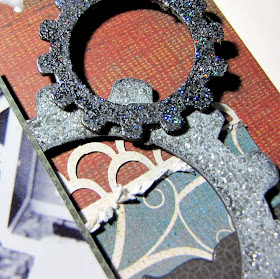
Technique: The light grey gears were painted with grey acrylic paint. Once dry, a very heavy layer of Pewter Distress Stickles was applied. Allow to dry again (you can always speed up any drying time with your heat gun). Finally, the edges of the gears were inked with Black Soot Distress ink.

Seventh B page titled 'Year 4' is another example of the technique used above.

Technique: I gave this one a 7B number since it's just another example of the technique used in the 7th page.

Eighth page titled 'Us'. Take out the mists for this one. Glimmer Mists, Smooch, Shimmerz...they all work.

Technique: The flourish chippies were treated with Cashmere & Pralines & Cream Smooch by Donna Salazar. Once dry, adhesive was lightly spread on them with my finger. Finally I sprinkled a bit of Fairy Dust glitter also by Donna Salazar on them. The result, a multi-colored soft effect with a bit of bling.

Bonus Tip: Take a look at the title 'Us'. The letters are also chipboard. To get the effect of a two-tone color on chipboard, first paint the chipboard with the lightest color. Once dry paint 1/2 of the chipboard with the darker color. Finally apply a heavy coat of coordination Distress Stickles. Where the two colors meet, slightly go over the border of the two colors with the Stickles--this will 'blend' the two colors at the meeting point.

Ninth page titled 'I Am'. Take out your stamps & embossing folders for this one.

Technique: The chippie was first painted with Jasmine Mix'd Media Ink by Donna Salazar. Once dry it was stamped with Faded Jeans distress ink & a French Script stamp by Hero Arts. Next dry emboss your chippie. I used a swirl embossing folder on mine. Finally I covered the chippie with embossing ink & heat embossed it with clear Kaleidoscope embossing powder by Stampendous. Result is an embossed stamped texture full of bling.

Tenth page titled "Girl In The Mirror". Once again Distress Stickles are used...but lightly along with Distress embossing powder.

Technique: Chipboard was first heat embossed with Vintage Photo Distress distress embossing powder. Then with my finger I rubbed off some of the particles to reveal a bit of the chipboard beneath. I then inked it with Vintage Photo Distress Ink. Finally I spread a light coat of Vintage Photo Distress Stickles.

If your chippie lends itself to it, why not dress it up with a bit of bling such as rhinestones or pearls.

Thanks for stopping by & taking a look. I hope this post inspires you to start experimenting with those chippies!