Jan 25, 2012

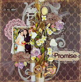
It All Began With A Promise


Good evening once again fellow scrappers! Seems like I've had a very productive January! I think this is the most I've posted in one month. :-) Let's just say that I started the New Year with lots of inspiration!

Today's page I made for the Bird Is The Word 'Promise' challenge & for Case #3 going on over at C.S.I. I think that the other reason for my consistent scrapping is these challenges that I've been participating in. They really do motivate you to scrap those pages.

This is my husband & I on our wedding day. Hard to believe that we're already heading into our 5th year of marriage.

Here's the challenge for C.S.I containing the color scheme I used on this page. The colors were more towards the pastel side but I took the darker shade of brown & made that my primary color. I then went with the lighter colors for everything else. Just a bit out of my comfort zone but that's what these challenges are about.

The bird cage is a wooden embellishment by Kaisercraft. The cute little bird on the cage I bought from Lidia's Etsy store--just one of several cute embellies she has in her shop.

The title is on a chipboard label by Dusty Attic. To give the chippie that metallic look--I first painted the chipboard with an ivory metallic acrylic paint. I then spritzed it with Pralines & Cream & Cashmere Smooch.
TIP: Want a unique way to store lengthy journaling but not exactly 'hide' it? Why not display it on your page as a scroll? As you can see from this photo--I used a scroll to hold my journaling & to add a unique embellishment to my page.

Just print your journaling on paper or vellum (or both like I did) & roll it up. Then take a pieces of scrap card stock or thick patterned paper--& cut two strips of paper about 1 3/4" inches long by 1/2" wide. NOTE: make sure that you use fairly thick card stock/patterned paper for the makeshift straps you're going to use to hold your scroll. If you use thin paper--the straps will most likely rip. Finally adhere the straps to your page making sure to leave enough room to slide your scroll through. NOTE: Use brads to decorate the ends of your straps. I adhered the brads to my straps as decoration. The straps are glued to my page with strong adhesive instead. These makeshift straps are what's going to hold your scroll in place so they have to be adhered very well onto your page. I felt that adhering them directly to the page with brads may end up ripping my page. So that's why I went about it this way.


Here's my scroll journaling taken out of it's holding spot. Once done, simply roll it back up & tuck it back into your straps!

As I mentioned in an earlier post--one of my resolutions was to use up the tons of ribbon in my stash. So I intertwined a bit of sheer gold ribbon amongst my flowers & Prima vine.
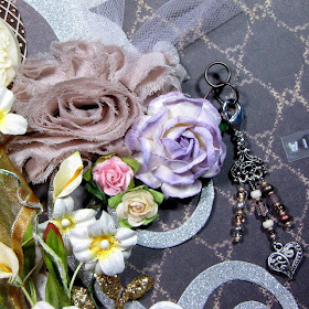
I once again used a bit of tulle for this page to give it a softer, delicate feel.

The cute little charm that I have hanging from my large mulberry paper rose with a Tim Holtz memo pin was also purchased in an Etsy shop. This one is owned by a very nice lady named Kat and her store Beyond Charms is full of lots of lovely charms just like this one that can be added to any page/card/project.

The two large light brown shabby roses was also bought at an Etsy store. Seems like I did a lot of shopping in Etsy for this page! That's the beauty of owning an Etsy shop of your own--you tend to support your other fellow crafters that are in the same boat as you. These shabby roses can be found over at Frog Feathers along with many other fabulous trims, lace & miscellaneous embellishments. The light pink crochet doily I also bought from Frog Feathers.

Finally an owl glimmer glass embellishment by Tattered Angels. I used a resin cameo by Webster's Pages for the owl's tummy.

Thanks to all of you who stop by for a visit!

Jan 23, 2012

Winter Fairy Card


Good evening fellow scrappers. I thought I'd quickly upload this card I made in early December. I wanted to upload this while we were still in 'winter' mode.

I bought this very adorable stamp over at Whimsy Stamps titled 'Winter Fairy'. This stamp gave me the opportunity to take out my Prismacolor pencils & do something I've loved to do since I was a child--color!

I used Stickles to further decorate my image.

I stamped the image on a piece of transparency & layered it over my original stamped image. You can see in this photo the very cool dimension the transparency provides--especially for the wings.

I handmade the stick pin with beads from my stash & tucked a small white doily in the upper corner.

I used small dots of White Liquid Pearls to simulate snow flakes falling in the background.

I tucked a bit of gauze in the lower right had corner of my image to simulate a bit of snow.

The pine cones were made with Tim Holtz's Pine Cone die. I dabbed a bit of white acrylic paint on them along with some Rock Candy Stickles to give the effect of snow--a tip I got from Mr. Tim Holtz himself.

The metallic red poinsettia is by Prima.

All the papers I used to make this card are Christmas themed papers I've had in my stash since forever. It was great to finally get the chance to use some of them up.

Jan 20, 2012

Remember 2011 Layout


TGIF fellow scrappers! Today was one of those Fridays that I refer to as 'Fiesty Friday'. Everybody was hyper at the office...not much work got done & we were all for the most part simply happy! Not sure if we're all burnt from the amount of work we've been having lately or we're all anticipating our supposed first 'snow storm' of the season or if there's just something in the air--but it was a great Friday!

I was also able to wrap up this page that I'm submitting for several challenges.

The first is for the Once Upon A Sketch (OUAS) January 15th challenge. The challenge was to journal about New Year's. Either 'Hello 2012' or 'Goodbye 2011'. I decided to journal about the one memory that most stood out in my mind for 2011--so I guess I went with 'Goodbye 2011'. I absolutely love this one photo me & my husband took while vacationing in Puerto Rico. The time, the place & the meaning behind it--just meant a lot to me. I've already scrapped it once before. You can see my first take of it here.

This is also being submitted for Case #2 going on over at C.S.I. I'm really enjoying their Alice in Wonderland theme.

Finally, this page also fit the requirements for the Bird Is The Word (BITW) 'Remember' challenge.

Here's the sketch provided by Nadia over at OUAS. I'm a fan of circular elements--so this sketch got my cogs & gears going as soon as I saw it. :-)

This is Case #2 for C.S.I. The colors for this case took me a little out of my comfort zone. I tend to be more of a 'grungy girl' & lean more towards the brownish/vintage colors & I don't tend to mix too many different colors on one page. However, all these bright colors just seemed to work/blend well together!? Who would've thought!

Ok, let's start with the close ups. The circle frame chippie is by Dusty Attic. I gave it the iridescent paint/embossing texture that I'm quite fond of when it comes to chipboard. I first painted the chipbard with metallic teal/green acrylic paint. With a white Sharpie paint marker I highlighted the edges of the flourishes on the circle frame in order to define them a bit more. Next, I inked the frame with embossing ink & heat embossed it with Kaleidoscope clear embossing powder by Stampendous. This particular embossing powder gives off this shimmery iridescent texture that is so very pretty in person & hard to truly capture with a camera.

The yellow butterflies I cut out from a Hambly overlay that I've had in my stash since before time. I finally found a use for it! :-) I wanted the butterflies to look as if they were flying out from behind the photo.

TIP: Want to try out a dimensional way of matting your photo? Simply rip & tear scraps of paper with your hands & layer them!

I ripped & tore several pieces of two sided paper straight & in angles. NOTE: This works best with two sided paper that has one light side & one dark side. I inked all the torn edges with Tea Dye Distress ink. I then layered all of these torn pieces one on top of the other in different angles & curled the edges on some of them. As I adhered the layers I tried to alternate the sides of the paper I used (dark versus light). This gives the effect of having many pieces of paper matting the photo when in reality it's just bits & scraps that are just layered one on top of the other.


One of the main reasons I love this photo so much is that I find it sweet & romantic. Sweet & romantic = tulle in my book. Tee-hee. There's something about tulle that 'softens' a page. So for the first time, I've incorporated a bit of tulle in my layout. I kept it simple. Just took a piece of tulle, tied it with a knot & then adhered it to my page. Done.

I also made the New Year's resolution to use up the tons of ribbon I have in my stash. So once again I've intertwined a piece of ribbon amongst all of my floral embellies.

The brick wall I traced with a fine point black marker and a Prima brick mask.

The random yellow misting was done with Yellow Daisy Glimmer Mist.

The gate stamp is by Prima. As I tend to do--I stamped my image on a transparency with StazOn Jet Black ink. This way I can place my image anywhere I wish & I don't have to worry about stamping it on crooked. I have total control of how my image will display! Yay!

A close up of the other cluster of embellies. The resin bird is by Prima. You can see my second tulle accent here as well.

I also used two small white doilies on either side of my matted photo. Since they're white like my background they add a soft subtle touch.

Finally...my hidden journaling. Ta-da! Turns out that one of those torn edges on top of my photo is actually a pull out tag where I hid a bit of nostalgic journaling. Journaling reads:

This was it. This was the defining moment of 2011 for me. This is the one memory I do not want to forget. One the eve of our 4th wedding anniversary we took a 'classic' photo during our vacation to Puerto Rico. One that I hope our future son or daughter will maybe one day try to reproduce. It's timeless. It's romantic...it's us.

Hope you all have a fabulous weekend & a big thanks as always to those who stop by for a visit.


Jan 12, 2012

New Years Slumber Layout


Good evening fellow scrappers! Today's page is one that I made for the January 1st challenge going on over at Once Upon A Sketch (OUAS). The challenge is to scrap how you spend New Years.

The journaling is hidden behind the photos. More on this in a few.

This is my husband sleeping on New Year's Eve. :-) This is how we usually spend it due to his demanding job. He's pretty much 24/7 hour production support for his company & it's very common for him to work entire nights, holidays, weekends etc. New Year's is no exception. So it's a joy for me to watch him sleep when he actually gets the chance to get a good night's sleep on a holiday.

I've used the Dreamer collection by 7 Dots Studio, a lot of stamping & many different embellishments for this page.

I'll also be submitting this page to the first Case File going on over at Color...Stories...Inspiration (C.S.I). Couldn't help but play along with their first 'case'. The whole concept behind this new site is just too cool to resist!

This is what the first case file is based on. It's Johnny Depp...enough said! lol

Here's the sketch provided by OUAS the page is based on.

I used ribbon along with a string of pearl beads to really give this page some dimension. The large gold leaves are by Prima. The mulberry flowers are from my stash. I once again used a tiny glass vial on my page. Along with a metal pen nib by Tim Holtz. I filled the vial with small black glass beads & wrapped a bit of hemp cord around it. I tucked a couple of tags from the Dreamer collection behind the vial & the pen nib.

I also used half of a crochet doily...you can see it peeking underneath the cluster of embellies.

A close up of one of the chipboard keys. These keys are by Dusty Attic. I used a Gold Paint Dabber by Ranger on the keys & dried them with a heat gun. To give the keys that 'stone' look just heavily apply the paint dabber on them so that little globs of paint are left behind.

Here's a close up of the waterfall journaling. You can find a tutorial for this technique here.

Being able to journal the story behind my husbands hectic schedule and why it's actually a pleasure to see him sleep on New Year's required some extensive story telling. I needed a way to document all of this & I didn't really want to store it behind the layout & on the layout it would take up too much room. So I leveraged the concept behind the waterfall card for this technique. This is also a great way to display different photos in a condensed matter.

Here's the waterfall journaling half-way out. I printed the journaling on transparency.

In this photo the journaling is completely pulled out.

Finally a closeup of my stamping. The script stamp & the grid stamp are by Tim Holtz. The script stamp is from the Mini Ornates stamp set & the grid is from the Ultimate Grunge set. The splatter stamps are by Recollections. I found this stamp set at my local Michaels. These stamps have almost become a trademark of mine! I've used them in just about all of my pages lately. I'm in love with them! lol

Thanks to all of you who stop by! I appreciate you taking the time to visit.


Waterfall Journaling Tutorial


Here's a brief tutorial on the waterfall journaling seen on my 'New Years Slumber' page.

I usually keep my journaling on the back of my pages. Sometimes--if I have the room--I'll have it in the front as part of my layout. However, for this layout I had an actual 'story' to tell with my page and I didn't necessarily want to put it behind my layout. I also didn't want to put it as part of my page because it would take up too much room. So what to do?

I had heard of the 'waterfall card' and knew of it for several years now actually. However, it wasn't until now that it occurred to me that I can leverage the waterfall card onto a layout and use it for journaling.

You can follow any waterfall card tutorial found on the internet & simply leverage it for your project. Following is how I went about doing the waterfall journaling for this particular page. TIP: This technique also allows you to display multiple photos in a condensed manner. My entire page is based specifically on this one photo--so I used multiples of the same photo for my layout.

So let's get started!

Step 1: Print 4 3" x 2" inch photos. Then cut out 4 3 1/4" x 2 1/4" inch card stocks that will be used to mat your photos

Step 2: Adhere your photos to the card stock mats. Cut out 1 3 1/4" x 9" inch card stock

Step 3: Starting at one end of the 3 1/4" x 9" piece of card stock score at 2", 2 3/4", 3 1/2" & 4 1/4" inches

Step 4: Fold along the scored lines. You should end up with a strip of paper like the one shown in the photo

Step 5: Adhere the photos along each scored section

Step 6: Cut out 1 4 1/2" x 3/4" piece of card stock/patterned paper & adhere it behind the first scored section (this should be behind the first photo from the bottom). Attach this small strip to the bottom edge of the larger strip...not to the bottom edge of the photo.

Attach an eyelet & a ribbon to the very bottom (long un-scored piece) of the 3 1/4" x 9" strip of paper. This is what will be used to pull your waterfall journaling out

Step 7: Punch holes on either side of the 4 1/2" x 3/4" inch strip of paper. This is where the eyelets will go & will attach your waterfall journaling to your layout. Figure out where you want your journaling to go. Punch corresponding holes based on where you decide to put your journaling & adhere it to your layout with eyelets. This is the only way your waterfall journaling will be attached to your layout.

NOTE: Do NOT glue the back of the waterfall journaling to your layout. Do NOT adhere any kind of embellishments that will block your journaling from being pulled out. You should be able to easily slide your waterfall journaling up & down with no obstacles when done

Hope you all enjoyed this tutorial & that it'll give some of you an option on how to document lengthy stories/journaling or multiple photos.

Jan 10, 2012

The Wonder Of You Layout


Good evening fellow scrappers! Today I bring you a pastel Christmas page. Now, pastel colors are not my norm when it comes to scrapbooking--I tend to go more for vintage/grungy colors. However, I really like how this page came out! For some reason these two photos of Toby sitting on Santa's lap alongside Santa's Little Helper said 'pastel' to me. So pastel it was.

Isn't my Toby a little ham? I swear he 'smiles' for most of his photos--these two being no exception. He's such a little character...

I've used papers by Pion Designs from their Santa's Little Helper II line. These papers came with the December kit by Funtoolas--a very cute Etsy shop filled with delicate embellishments & very well coordinated kits for scrapbooking. This will be the third page I've completed with elements from this kit. Needless to say, I've thoroughly enjoyed this kit!

The peach crochet doilies are also from an Etsy shop titled 'Frog Feathers'. This little shop has lots of trims and other goodies that can be used for scrapbooking.

I'm submitting this page to the Bird Is The Word challenge blog. This page is for their 'Wonder' challenge.

The title is a combination of clear labels made with my Dymo Caption maker & letters adhered to a piece of clear acrylic/transparency. I've been using transparencies more & more on my layouts because it offers more dimensional possibilities. If you're a dimensional lover like yours truly--then this is the way to go.

TIP: To position titles over ribbon, beads, pearls, brads or any other bulky embellishment--consider adhering the letters to a piece of transparency. As shown here the word 'wonder' was first adhered to a piece of transparency and then adhered over my string of pearls. You can't even see the transparency which makes it look like the word 'wonder' is perfectly balanced on my string of pearls!

Speaking of pearls...I've had strings of pearls in my stash for the longest time in all sorts of colors. I figured it's about time I started using them. So lately I've been adhering them in a random sorta way onto my pages. I just like the randomness they supply to the page.

I've taken out my splatter stamps once again for this page & have randomly stamped splats & splatters in the background. This stamp set is by Recollections & I found it at my local Michaels. The snowflakes & black flourishes are also stamps--these are by Inkadinkado.

The two large white crochet snowflakes came with the Funtoolas kit.

I once again used a bit of cheese cloth to mat my photos. I am loving the effect cheese cloth gives when tucked behind photos.

The black flourishes were stamped on acrylic. TIP: Stamping your images on acrylic/transparencies gives you much more flexibility on the placement & orientation of your image. For example the flourish is actually the reverse image of the actual stamp. I liked how it looked better reversed. If it wasn't for the transparency--I wouldn't have this option.

I further decorated the black flourish by adding some clear rhinestones & Star Dust Stickles.

A close up of the snowflakes border chipboard. I first painted the snowflakes with metallic blue acrylic ink. I then randomly dabbed a bit of Silver Paint Dabbers on them by Ranger. Finally I randomly spread adhesive & sprinkled a bit of Fairy Dust Glitter by Donna Salazar on them. They're even more shimmery in person!

These dimensional Christmas trees are making their second appearance. I first used these in my 'Magic' layout. I have made a tutorial for these trees & will post it soon. They are actually a stamp that I've altered to give the trees lots of depth/dimension.

Thanks to all of you who stop by for a visit! I'll be back soon.