PLEASE NOTE: I've moved! Feel free to continue following me via my new blog Embrace Serendipity.

**All tutorials & the majority of the posts from this blog have been moved over to my new blog**


Oct 15, 2013

I've Moved!!

PLEASE NOTE: I've moved! Feel free to continue following me via my new blog Embrace Serendipity.

**All tutorials & the majority of the posts from this blog have been moved over to my new blog**

Sep 4, 2013

Introducing Embrace Serendipity

Hello once again fellow crafters!  For those of you who may not know--I've been missing in action for the past 2-3 months.  We recently moved to a new home & I honestly didn't realize how much this move would turn my world upside down.  We're now in a much bigger house where I even have a designated craft room.  Something I've dreamed of for a very long time.  However, settling in & getting back into some kind of a routine has taken a very long time.  At least longer than I had anticipated.  Many who have bought & sold homes in the past have told me that it's very normal to be completely overwhelmed when settling into a new home.  So I don't feel too bad that it's taken me this long to get back into the swing of things.

With this said--a couple of things will be happening in the next few weeks.  For one, I'll be re-opening my Etsy shop.  I definitely hope to have this back up by the end of September.  Second, I have a brand new blog.  A big thank you to the fabulous & very talented Emma Stafrace who designed the blog for me.  I had a vision & she made this vision a reality!  I'm so very excited to introduce Embrace Serendipity.  Therefore, this post will be the last one on this blog.  Please do feel free to continue following me via my new blog.

My new blow is a work in progress--I've transferred most of my tutorials over & will start to upload formal posts very soon.  I have a few old projects to share & many new ones coming up!

I hope to see many of you over at my new blog.  As always, I big thank you to all of those who stop by for a visit!

Jun 26, 2013

You Are My Sunshine Layout


Hello fellow scrappers!  Yes, I know--where have I been!?  Well just one word.  Packing!  I'm the middle of buying & selling a home & for those of you out there that have done this, I'm sure you're quite aware as to how hectic, stressful & time consuming this entire process is.  We're set to physically move in less than a week & packing/prepping has been taking up a gigantic amount of my time--in addtion to my full time job that eats up 8 hours of my day.  I'm hoping that once I move & get the time to settle down I'll slowly get back into my old routine.  I sure do miss it!  I haven't been able to peacefully scrap in about 2 months now.

Today I finally decided to take a break & put up this post.  For me this is a sanity check--am going back for just a few minutes to something that I love which is crafting.  I decided to post this layout I made for both Authentique & Clear Scraps.  I've also used several of Authentique's new stamps made by Hampton Art.  Authentique has 3 of these sets which are co-branded by Hampton Art.  All papers used were from Authentique's Seasons: Summer Collection.

This is my son during one of his 'tummy time' sessions.  He's got these huge almond shaped eyes & this photo captured those big doe eyes at thier best.  :-)

The script stamp as well as the stamped 'You Are My Sunshine' title are new stamps by Authentique/Hampton Art.  The script stamp is from the 'Keep Me Posted' collection & the title is from the 'Footloose' collection.

The stamped sentiment is from the 'Grateful Heart' collection.

My cluster of embellies including my journaling which is stored in a scroll.  This is officially a must for me now.  I document all the stories behind my layouts & I found this to be the most convenient for me.

For this stamp I heat embossed it with black glittered embossing powder to give it a bit more dimension.

This acrylic frame is by Clear Scraps.  It's the Small Oval Fancy Frame.  To give it color I applied drops of alcohol inks directly from the bottle onto the acrylic frame.  Then waited a few minutes for it to dry.  Directly applying alcohol inks onto acrylic in this way produces much more bolder colors & design.

Another close up of the acrylic frame as well as my masking in the upper corners of my layout.  The mask used is the 6" Swirl Mascil also by Clear Scraps.

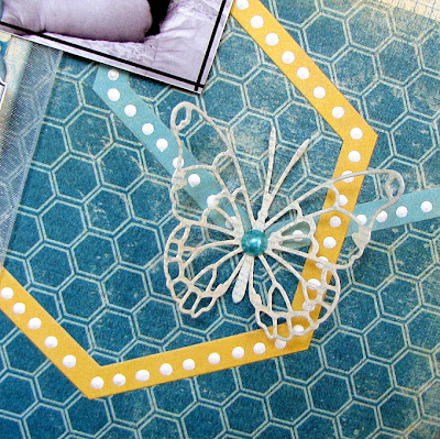
I added more dimension all along my page by placing dots of acrylic paint onto my honeycomb die cuts. 

Thanks for stopping by & I hope to be back soon with more posts.  I'll most likely be MIA for a bit longer while I move & actually settle down.  In the meantime, enjoy the rest of the week!

May 29, 2013

Spring Into Summer Card - Clear Scraps Blog Hop


Welcome to the Clear Scraps 'Ideas For Summer Crafting' Blog Hop!  If you're here from Wendy's blog then you're on the right track!

For this blog hop I decided to do a Summer themed card.  I've used the Half Scallop Send It Clear Card by Clear Scraps.

I've decorated it with designer paper by Authentique & have highlighted the border with a Blue Sharpie Oil Based Paint Pen.  All the flourishes & decorative elements seen in the pictures are rub ons which work wonders on acrylic!

Here are a few more close ups...


I love the subtle yet visually appealing effect you get by highlighting the edges of a 'Send It Clear Card'.

Your next stop is Pinky's blog.  Thanks for stopping by & don't forget to leave comments on each blog that you visit in order to qualify for a Clear Scraps prize!

Enjoy the rest of the week!

May 15, 2013

Endless Love Layout


Good evening fellow scrappers!  Happy May--to me May is equivalent with mom.  This particular Mother's Day was very specifal for me because it's the first Mother's Day that I'll be celebrating being a mom myself!  What an incredibly rewarding feeling this is!  So in honor of this speciall event here's a page made with me & my little guy.  This is a DT page that I've made for Authentique & Clear Scraps.  I've used Authentique's lovely papers from the 'Grace' collection. 'Grace' is geared towards mothers, sisters, daughters, grandmothers or friend.  It's lovely mixture of florals, feminine patters & sweet sentiments which made it just right for this layout based on myself with my little guy.

As my son gets a bit older it's become quite clear that he's got my eyes.  They are large, a bit on the almond shaped side & a perfect shade of dark brown.  My husband's eyes are blue & I remember that I wished so much for my son's eyes to have my husbands ocean blue eyes.  But fate decided that he would have his mother's eyes--and I'm so happy it turned out this way!  I feel so very connected with him in many ways--but the fact that he has his mother's eyes adds one very extra special connection to me.

I've also used one of Clear Scraps newest additions--a Clearly Framed Medium Circle Scallop Frame on this page.


As you can see, I've become addicted to these tiny flocked teddy bears that I buy at my local AC Moore.  I've bought many of them in all different colors!  They make for the cutest embellishments for child or baby themed pages!

The wooden sentiment spoke to me in a special way--basically because since my son was born I've always sang to him "You Are My Sunshine".  Whether it's to soothe him from crying, to put him to sleep or to make him smile--the song does wonders for him.

I've once again used the hot air balloon die by La-La Land Crafts!   I feel that it's the cutest die & can be decorated in several ways.

To make the waved border seen in the background of my page, I've used a template by Kiwi Lane called Paisley Place.   To further decorate this border I've adhered a bit of lace to the bottom layer & edge of the top layer is distressed & inked.

Here you can see several papers from the 'Grace' collection layered to form my background as well as one of their many stickers that are part of & coordinate with this collection.

Here's a close up of the Clear Scraps Scallop Circle Frame.  I first highlighted the border of the frame with a permanent white Sharpie Oil Based Paint Marker.  I then cut the frame in half--ran each half through my Big Shot in order to dry emboss it & give it a bit of dimension & texture & I was done!  This is a very simple technique for acrylic but adds a really nice subtle touch to any project.

The butterflies are items from my small Etsy shop--these would be the 'Vintage Flair' butterflies.  I have these & many other butterflies available in shop here if interested.

This lovely handmade flower was bought from yet another Etsy shop titled 'More Paper Than Shoes'.  Anna, the owner, makes many beautiful & delicate handmade flowers--not just for crafting but for weddings, corsages and more!  You can check out her shop here if interested.

I really enjoy all the little sentiments that came with this collection.  I didn't have many coordinating embellies on hand for this page--but when I saw all of the little sentiments & stickers that came with 'Grace' I realized that I had nothing to worry about.

Thanks for taking the time to stop by--hope you all had a wonderful Mother's Day.  Enjoy the rest of the week!

May 7, 2013

24/7 Layout


Good morning fellow crafters!  Today's post is a page made for Berry71Bleu's May Challenge.  The Berry71Bleu DT had the honor of collaborating with Once Upon A...Sketch (OUAS) this month!  So to enter this month's challenge you must first use the sketch provided by Nadia from OUAS & incorporate their challenge of using numbers anywhere on your project.  The number can represent anything from your age, to birthdays to an anniversary--anything with numbers will work.  Second you'll need to incorporate chipboard into your project which is Berry71Bleu's challenge.

I decided to use numbers as part of the sentiment behind my page.  This would be my son at approximately 1 1/2 months of age giving me one of his more 'pensive' looks.  :-)  Part of my journaling states how he's in my heart '24/7'.

Here's the sketch provided by Nadia from OUAS that my page is based on.

I added much more texture to my background by combining several stamps & creating a sort of collage.  I used approximately 6 to 7 stamps & created the collage by overlapping the stamped images & by using different inks to do so.  I've used black, green, purple & gray inks just to name a few.

All papers are from Lucky7 Factory & all the chippies are from Scrap FX which are also a few of Berry71Bleu's sponsors for the month of May.

I created simple circular embellishments throughout my page by using a circle punch to punch out circles & adhere them to the center of my circular stamped images with a foam dot.  I inked all the edges of the circles to make them stand out more & added dots of acrylic paint to sections of the circle borders. 

The spiral tissue flowers were also sponsored by Lucky7 Factory.  The transparent butterfly is a new embellishment that will soon be available in my Etsy shop.

I'm a big fan of owls & love placing them in my pages whenever I can.

This lovely tag was handmade by Marivic & my journaling is stored in the scroll right next to the tag.  Storing my journaling in the form of scrolls has almost become my trademark.  I tend to use these on just about all of my pages.  I have a tutorial on how I make these scrolls here if interested.

Finally, my cluster of embellies consisting of a flocked black teddy bear, spiral tissue flower by Lucky7 Factory & ribbon flowers that are from my own stash.

Thanks for stopping by & do take the time to visit both the OUAS & Berry71Bleu blogs for more inspiration.  Play along with both if you can!  There are prizes to be won by a few lucky winners on both challenge blogs!

May 2, 2013

Spring Mini Album


Hello again fellow crafters & welcome to May!  Finally here in the North East Coast I can honestly say that Spring has arrived.  On that note, I've decided to post this 'Spring' themed mini album.  For this mini I've joined two fabulous manufacturers to create one very colorful mini album.  All papers used for this mini is by Authentique & the mini acrylic & chipboard album is by Clear Scraps

The paper is from Authentique's Petite 'Spring' collection & the mini album is the Spring Mixables album.  I thoroughly enjoyed working with a mini that consisted of both acrylic & chipboard pages--the possibilities are so many with this combination & the clear nature of the acrylic pages adds such a wonderful visual appeal.

I've highlighted the cover of the mini by first going over the edges with a pink Sharpie Oil Based Paint marker which is a permanent marker.  Any time you want to work with acrylic, it's best to use permanent markers  and/ or permanent inks such as Staz-On.  Next with a thin paint brush I've applied a thin layer of clear dry adhesive & spread Diamond Dust onto the adhesive.  Once dry you get that 'crystal' effect all along the border and since the Diamond Dust is transparent & the adhesive dries clear, you'll see the pink Sharpie line peek through.

Here's a closer look at the cover edges.  You can also see the border of a chipboard page behind the acrylic page.  I've covered all of my chipboard pages with designer paper, sanded the edges in order to smooth them out and then inked all the edges with Vintage Photo Distress ink.  Finally I added dots of either Stickles or acrylic paint along the edges to further dress them up.

I've decorated the acrylic pages mostly with images that were cut from the Authentique papers & with rub-ons.  In this photo you can see the different designs that are created with the acrylic & chipboard page combinations.

The doilies is what will hold my photos.  I've yet to take the photos that will go into this mini!  I just know that once I do--the mini album will be prepped & ready to hold them.  I may journal or tell the stories of my pictures on the inside of the last page of my mini or I may simply decide to add more photos here.  I haven't quite decided yet.

Isn't this umbrella & banner the perfect touch to a 'Spring' themed mini?  When I saw these images I knew I had to fussy cut them out and arrange them onto my front cover.  The mushroom bird & bird's nest are from my stash.  These are little embellies I find by sometimes taking the time to go through the .50 cents or $1.00 clearance bin at my local craft store.

Isn't the design of this album creative?  The chipboard page is actually cut in the shape of two flowers.  I've positioned my doilies on the following page so that when I adhere the photos, they'll peek through the center of the flowers that will 'frame' them when you're on this particular page.

As you can see I added dots of either Stickles or acrylic paint along just about all the borders of this mini.  I think it helps the edges stand out a bit more.

This mini can hold approximately 6-8 photos--it all depends on how you design it.  I've added tulle & ribbon to the rings holding my mini together.

Thanks for stopping by & I hope you've been inspired to create a few 'Spring' themed projects!  Enjoy the rest of the week.

Apr 23, 2013

Daddy & Me Altered Picture Frame


Good evening fellow scrappers!  Spring is here--although it was barely 50 degrees here in the northern East Coast.  Ugh...Mother Nature is playing mind games it seems.  This is also when everybody seems to get sick.  Hot one day, cold the next.  I just got over a nasty chest cold that knocked me off my game for the past two weeks or so.  I haven't been able to Zumba in two weeks!!  GASP!  I'm in complete withdrawal...tomorrow I'm going back and with a vengeance!  Gonna shake it till I can't take it!

Before I do that though, I figured I'd drop a quick post & share this altered wooden mini album that I created for the April Berry71Bleu challenge.  Here's my husband & son.  I captured my son's beautiful bright smile in this one & felt it was very much 'frame-worthy'!

I'm a big fan of plain wooden square frames.  First because they're quite affordable.  I got this one at my local Michaels for $1.50.  Second, because they're plain it's a crafter's dream!  You can do just about anything to it.  Paint it, stain it, stencil it, apply loads of mixed media to it or keep it simple and just adhere a bit of designer paper to it--which is what I decided to do.

I used paper from Inkido which also happens to be one of our sponsors for the month of April!  This was my first time working with Inkido and I have to say--they have lovely pattern paper.

I've used a combination of felt, mulberry paper & organza ribbon flowers to satisfy Debbie's April challenge which is to use flowers on your project.

The large felt flower I purchased from an Etsy shop called Knock Knocking.  The light blue organza ribbon star flower are flowers from my stash.  I have several of these organza ribbon star flowers in various colors up for grabs now in my shop.  Feel free to take a look if interested!

This is why scrappers never throw anything out.  This is one of two mini peacocks that I've had in my stash since Eternity was in diapers!  After all this time--I discovered that they'd make quite a unique decoration for a wooden frame.  So here's the first of two peacocks strutting it's feathers on my wooden frame.

The butterflies were hand cut from one of Inkido's designer papers.  This collection has several images of lovely butterflies, flowers & birds that can be fussy cut & used as embellishments for your projects.  I further dressed up the butterflies by applying a bit of Black Diamond Stickles to the bodies.

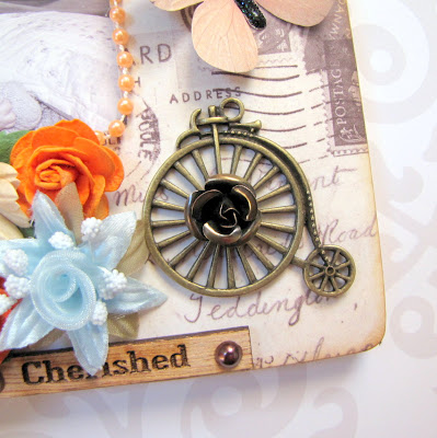
Gotta love these metal trinkets!  They make for great embellies to masculine themed projects.

A side view of my frame.  I have yet to decide if I'm going to display this at my home or at my work desk at the office.  I'm leaning more towards work--we all need as many happy thoughts & distractions at work as we can get!

Make sure you stop by Berry71Bleu and play along with the April challenge!  There are a few fabulous prizes for some lucky players up for grabs.  You can see all the details of the challenge plus the rules & prizes here.

Thanks for stopping by & enjoy the rest of the week!