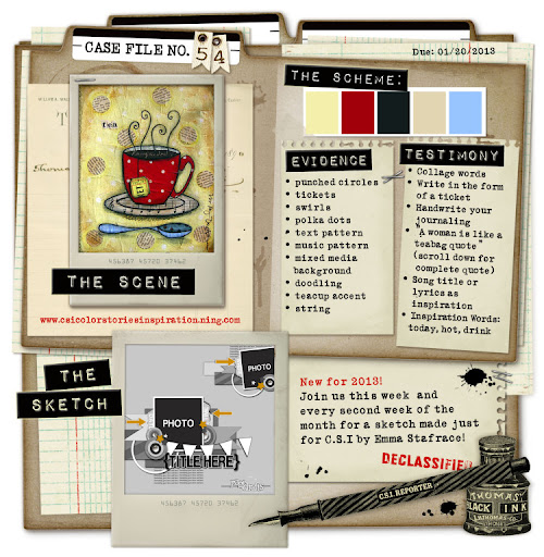
The current challenge going on over at Colors...Stories...Inspiration (C.S.I) triggered this re-do. I found the color palette to be just right for this page.
So here is me & my hubby over 5 years ago on our wedding day. Yes, it's been 5 years already! I know for those of you who have been married 10, 15 or 20+ years 5 is probably not such a biggie. However, I'm more surprised not by the number but by how fast these 5 years have flown by! It just feels like yesterday that we were exchanging vows & here we are going on our 6th year together. I'm sure pretty soon I'll be talking about our 10th anniversary--sigh...tick tock tick tock...
Here's the C.S.I challenge I based my page on.
For my evidence I have: tickets, swirls & music pattern
For my testimony I've used the song title & lyrics from a song
I've also based my design on the provided sketch.
The 'Love' part of the title is an Acrylic Expression by Clear Scraps. I kept the texture of the title simple. All I did was highlight the edges of the letters with a red Sharpie Oil based Paint pen. This gave my title the simple & perfect effect I wanted.
The Love tickets are by Tim Holtz. The lyrics are from Harry Connick Jr.'s song "Recipe For Making Love"--which is also the title for my layout.
We also played this song at our wedding: A little bit of me & a whole lot of you. Add a dash of starlight & a dozen roses too. Then let it rise for a hundred years or two. And that's the recipe for making love.
We found this to be a very cute song to be part of our wedding--it also helps that I'm a huge jazz fan! :-)
The light blue pearl string I've had in my stash for ages. In fact I have various pearl strings in my stash that I really need to use up. So you'll be seeing these trims on several of my projects.
The little glass vial is filled with tiny little red hearts that I had in my stash. I knew those little hearts would come in handy one day!
The large handmade flower I bought from an Etsy store called More Paper Than Shoes. Anna the owner, creates various handmade flowers that add a perfect touch to layouts, projects & even weddings!
The little paper rolls are just scraps of left over patterned paper from other projects that I've rolled up & glued to my page.
The floral frame that surrounds my photos is actually a stamp. It's the large cameo frame stamp by Stampendous. The stamp itself is much smaller than what you see here--however you can make any stamp to be any size for your needs with the use of a scanner. So if you have a scanner at home--just do the following.
TIP: If you have a stamp that you wish to use on your project but it's too small or too big--stamp the image with black ink onto a sheet of plain white card stock. I use Staz On for this step because Staz On tends to provide a very sharp stamped image. Scan your image & import the image to your computer. Then with a photo/image editing tool like Photoshop or even Picasa resize your image to the size you need. Then just print the image out & you're done! For my page, I needed the frame to be transparent. So I printed it onto a printable transparency sheet--cut the image out & then adhered it to my page. Voila! Instant frame!
The wedding couple I cut out from my original page. If interested you can see my original take on this page here. I decided to keep this image from my original page & use it here. You can also see how much my scrapping style has evolved through the years.
I've created the veil for the bride by adhering a bit of black tulle to a decorative brad & then attaching it to her head.
Thanks for stopping by & enjoy the rest of the week!


2 comments:
So nice!
Wow, what a gorgeous layout!! It's so perfect and well put together!! Beautiful photos and I love all of the little and thoughtful details!!
Post a Comment